ACADEMIC PROJECT
Graphic design · Packaging
CONCEPT · DESIGN · PHOTOGRAPHY · 3D
Carlota Carrillo
DECEMBER, 2018
*The project has not been taken into production. The mentioned clients were invited by the design school so as to help us, students, learn to understand better the client's needs and as way of enriching the learning experience.
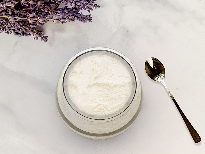
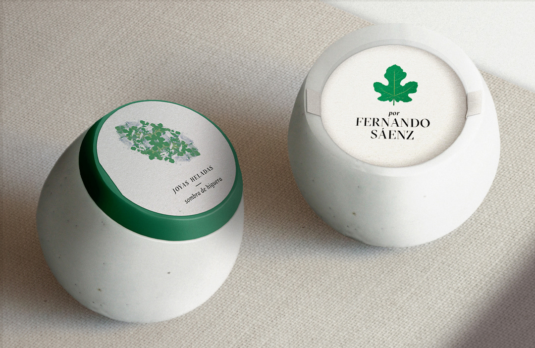
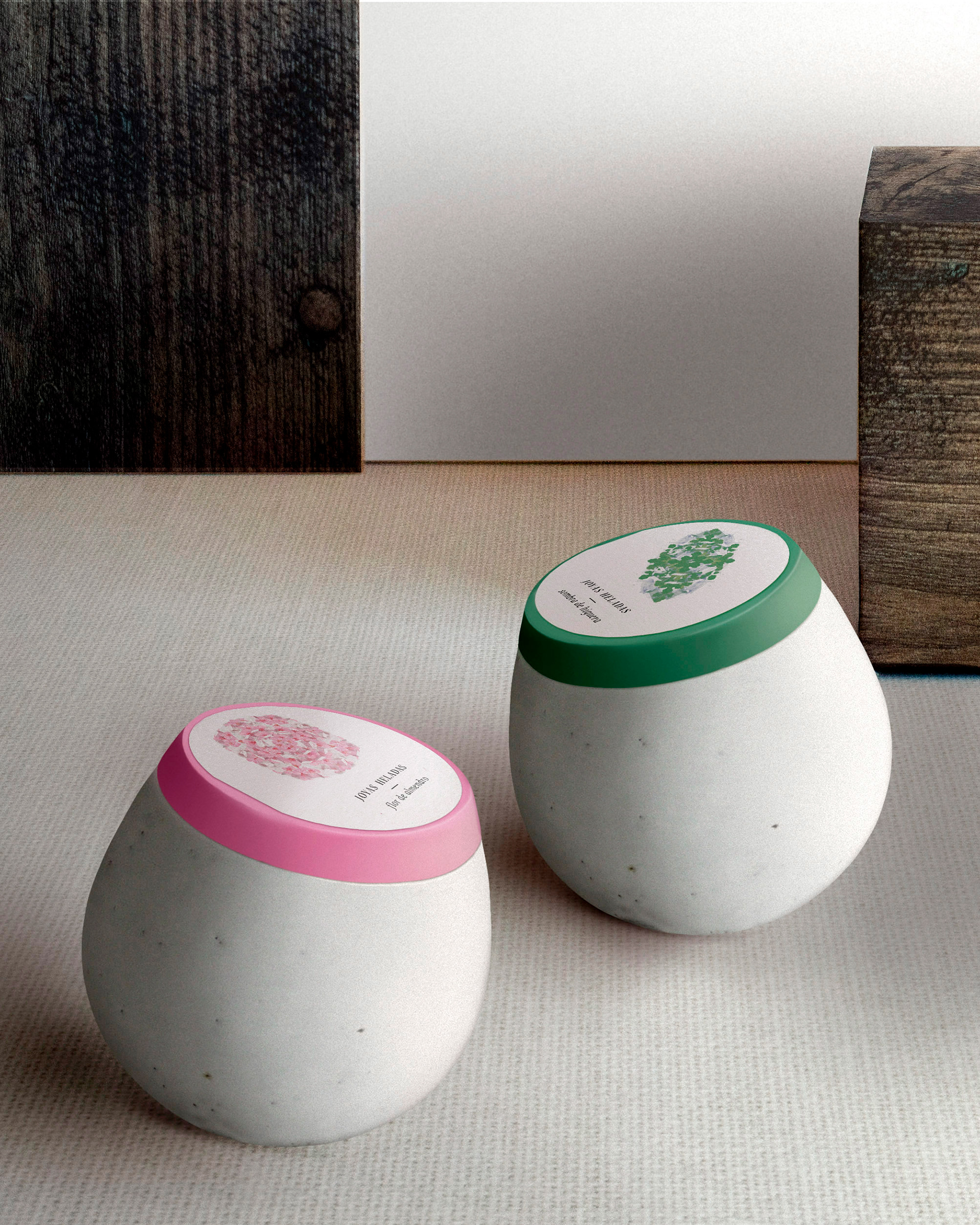
"The safe of the iced jewels". That is the name of the room in Fernando Saenz's premises where the ice creams are safely stored. That sentence was also the premise under which we designed the following packaging. Due to the fact that the products will be consumed in a haute cuisine restaurant, harmony and correlation between the container and the interior of the restaurant was necessary.
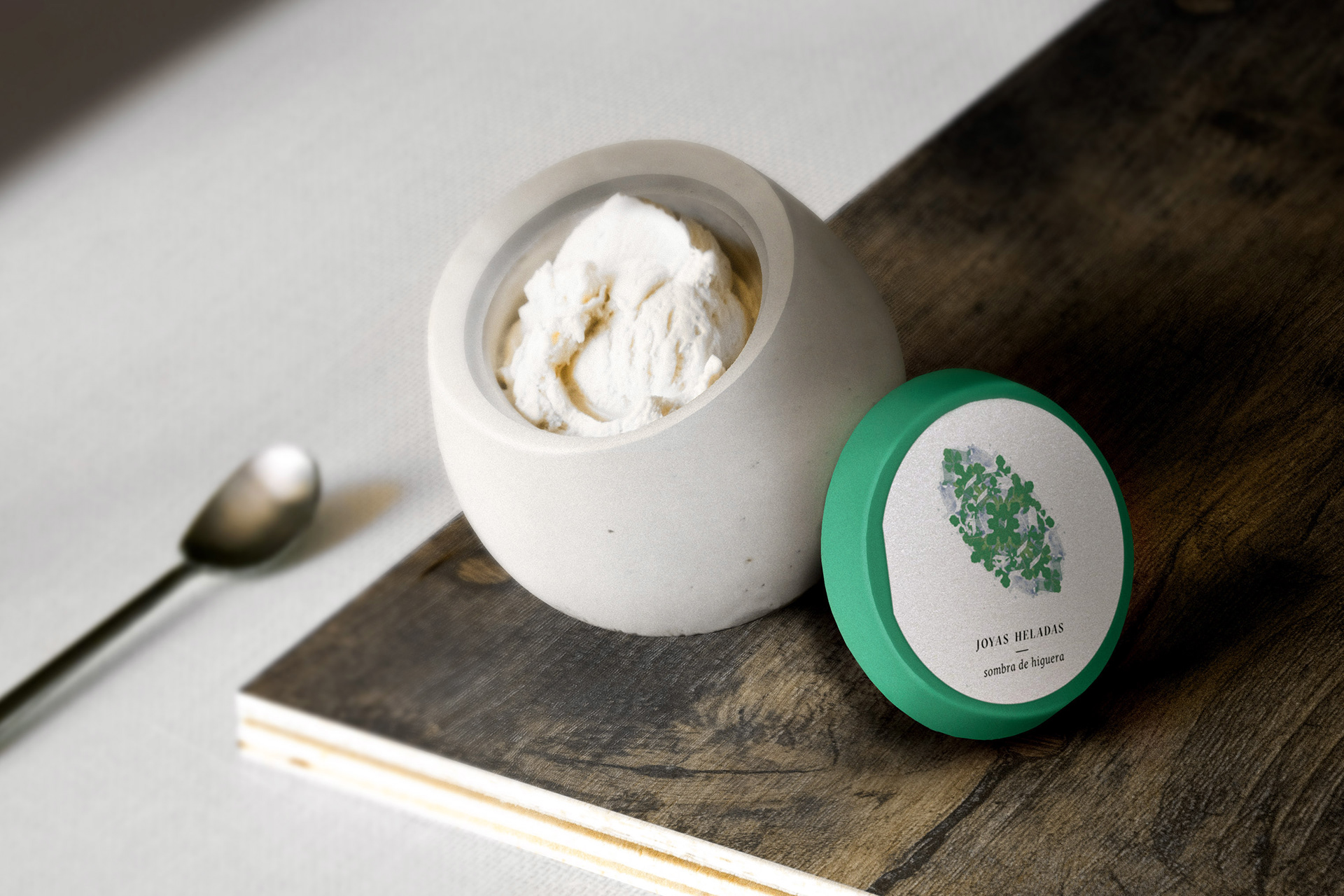
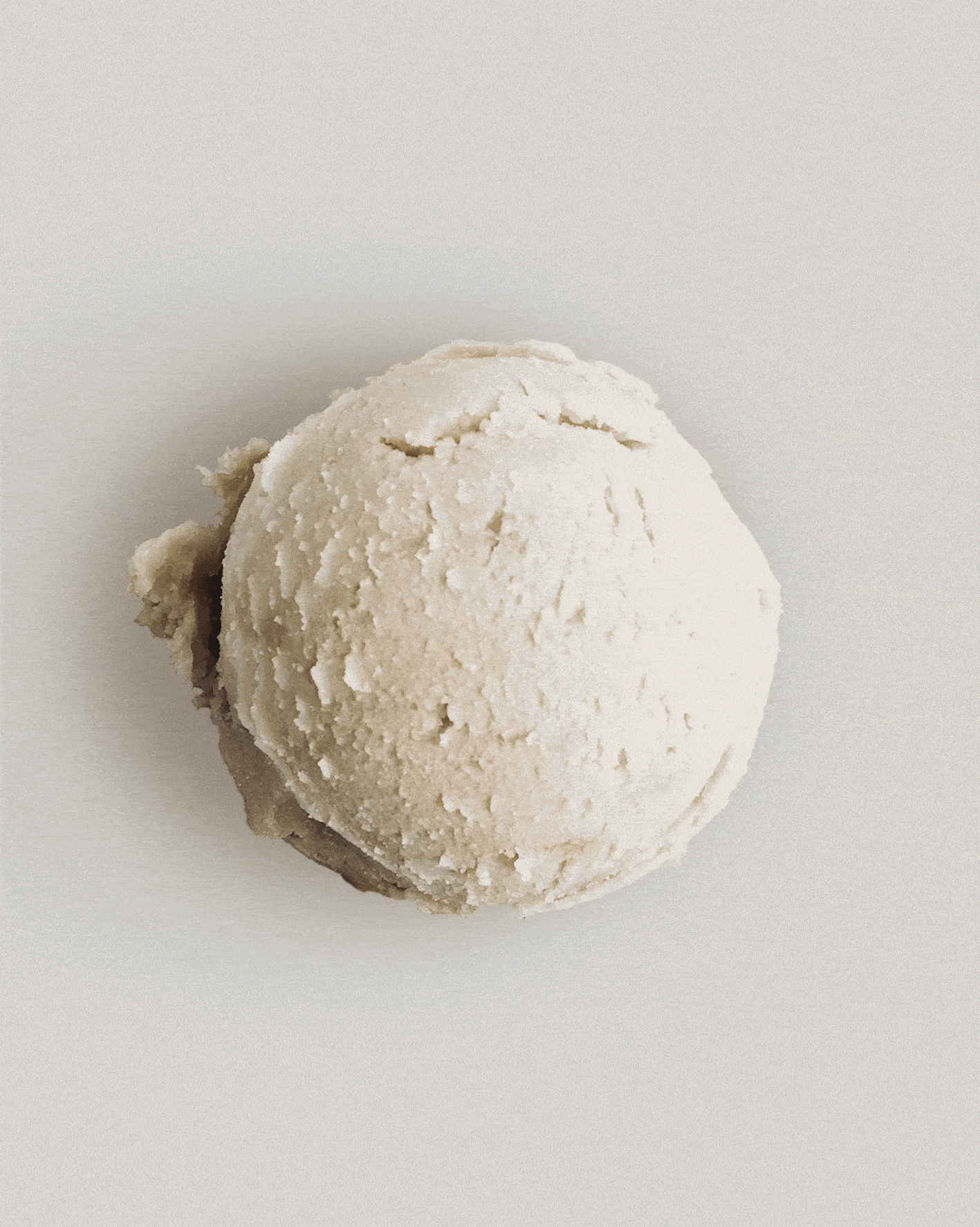
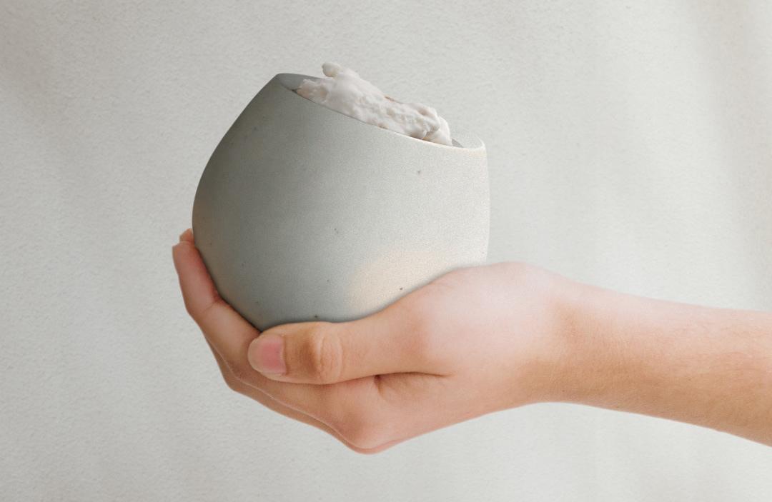
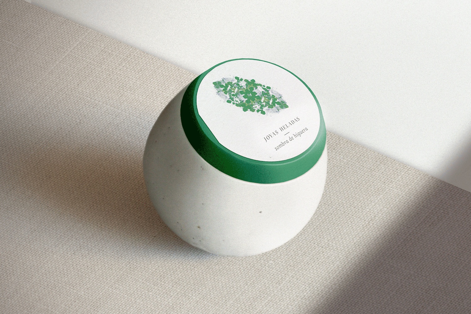
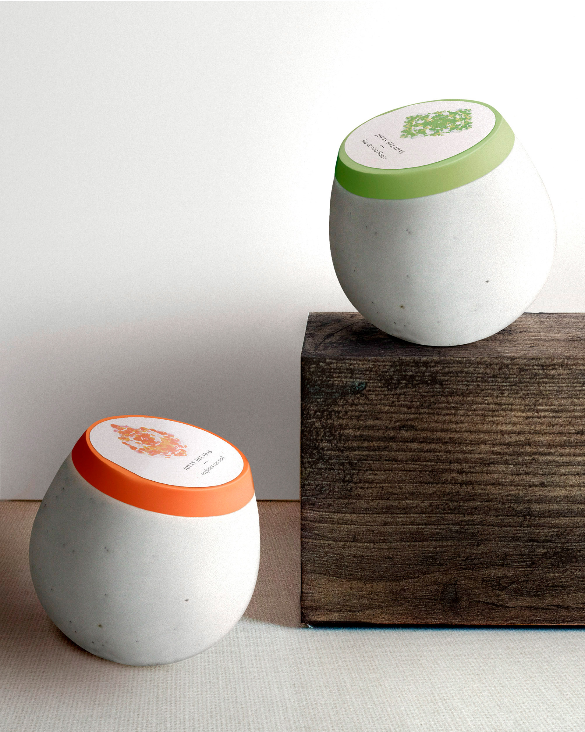
The result is a 120 ml container made in ceramics. Its shape is reminiscent of the ice cream scoops which gives the product full protagonism. Moreover, it links it to its artisanal, special and unique character.
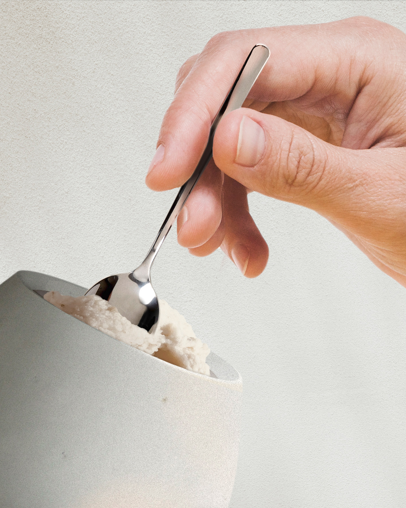
The packaging is completed with a paper peel-off label and wooden lid, that prevents frosting and ensures the preservation of the ice cream's texture and flavor. We aimed at creating a pleasant consumption experience. For that reason, we tilted the mouth of the container following the gesture that the diner will make when introducing the spoon, resulting in a more ergonomic and comfortable packaging.
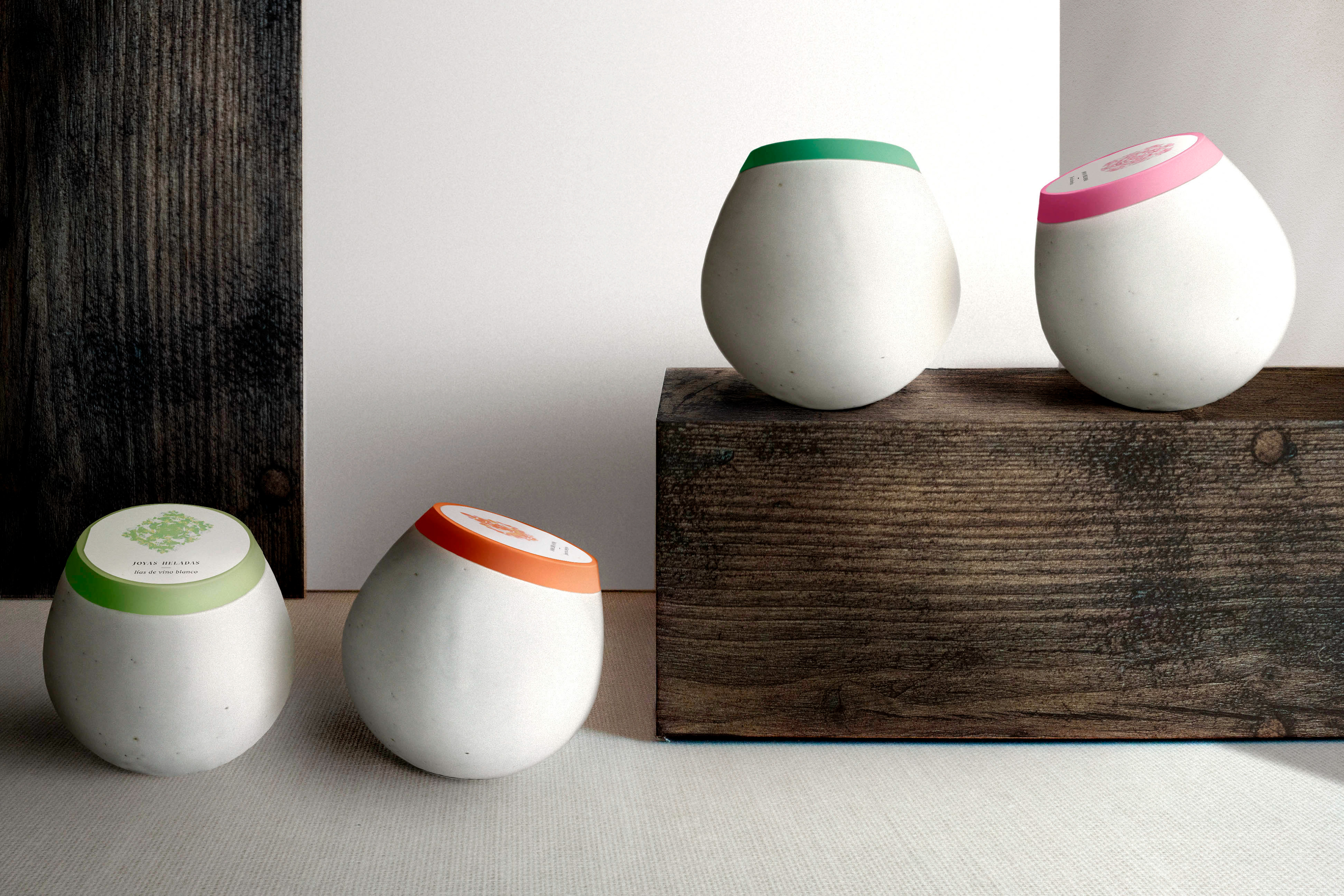
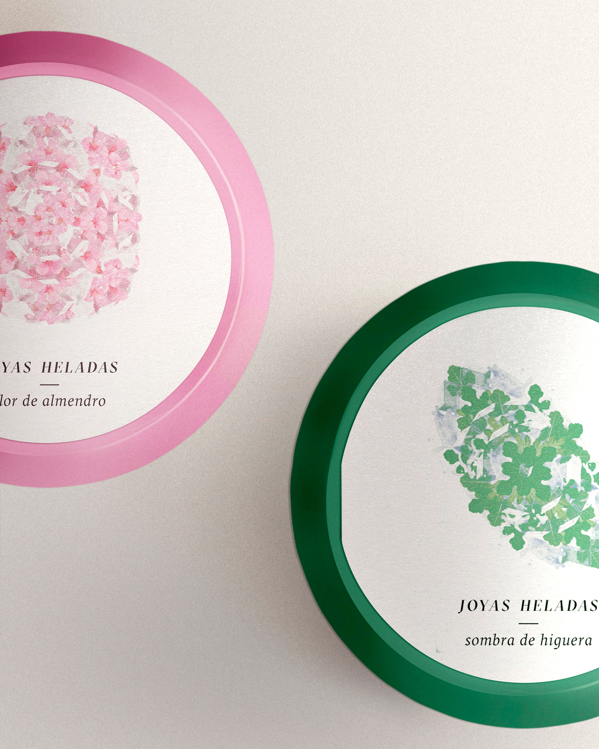
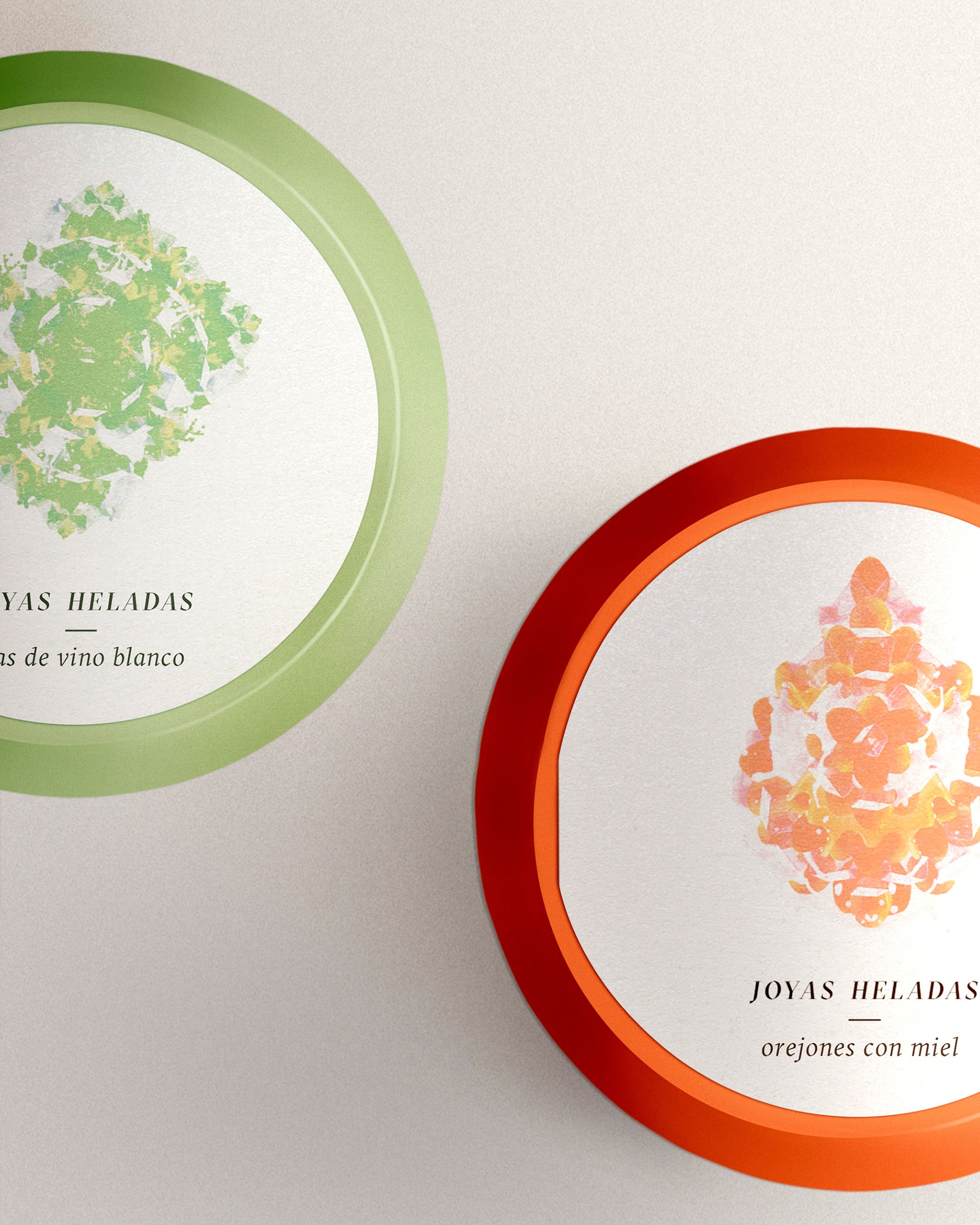
The diamond illustrations of the label are designed using the few and natural ingredients that Fernando needs in the making of each ice-cream. These, together with the color of the lid help to identify each flavor and elevate the product to the category of "iced jewel".
______________________________
ESDIR was invited to participate in the Verallia Design Awards 2019.
To fit the requirements of the contest, the container was slightly modified and named Bubbles.
That way, it would be able to be produced in glass.
Bubbles won the silver award.